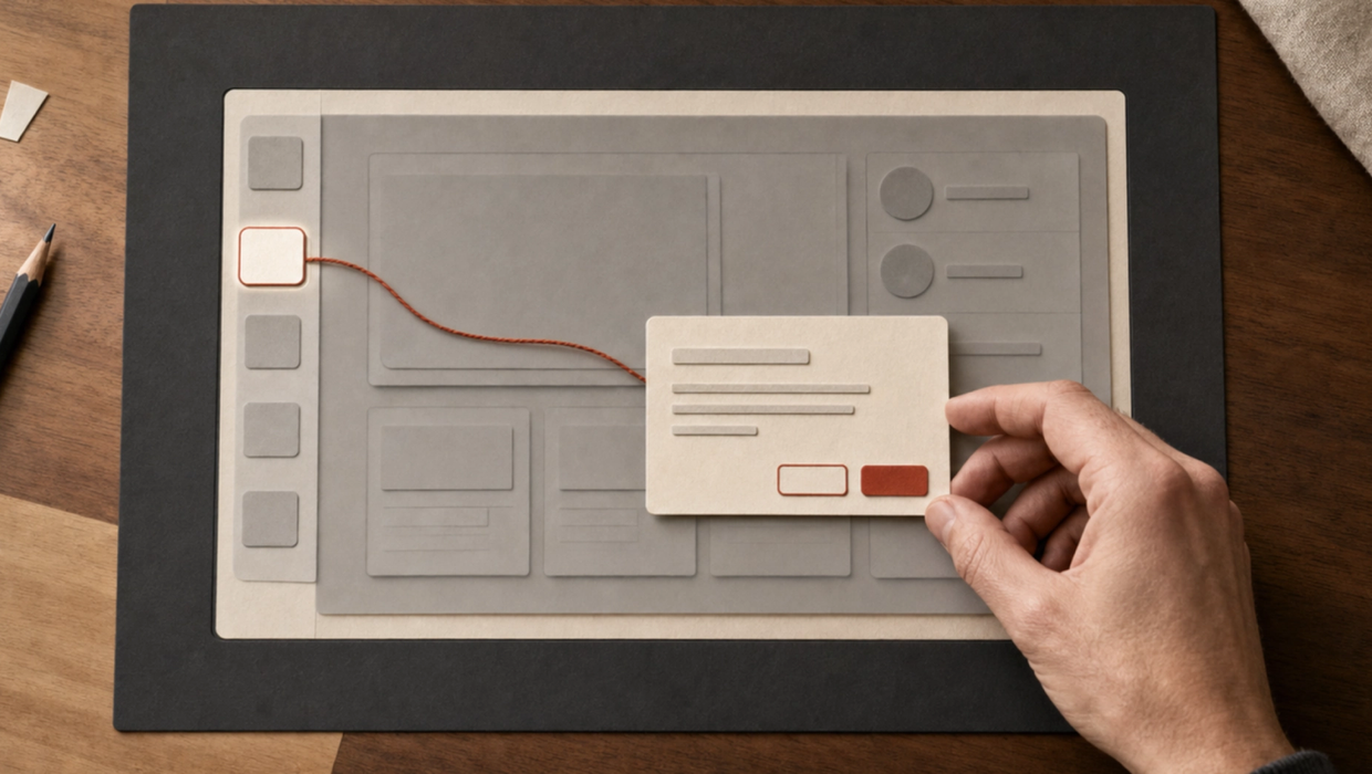
I needed a guided tour for FerbuTech Hub. It sounded like a normal product task: highlight part of the interface, explain it, and move to the next step.
I started with a general React tour library. That was still the sensible place to begin. It already handled positioning, keyboard controls, focus, and the spotlight around each target.
The first integration did not quite fit the application, though. The page dimmed, but the coachmark was missing. After I fixed that, most of the tour targets could not be found.
Neither problem meant the library was bad. They came from two assumptions that did not hold across the Astryx component boundaries in this app.
Working through those assumptions led to Astryx Joyride (https://github.com/IgloooNOR/astryx-joyride), a small open-source guided-tour package built around React refs.
What the tour needed to handle
The tour runs across an Astryx AppShell. It points to the dashboard, navigation items, settings, an administrator area, and a button that can restart the tour later.
Some of those elements appear at different times. Navigation changes between desktop and mobile. Permission-dependent items are not available to every user.
The application also needs to remember when someone finishes the tour without preventing them from running it again.
A useful implementation therefore needed more than a sequence of tooltips. It had to work with routes, responsive navigation, permissions, asynchronous rendering, keyboard input, and focus restoration.
The coachmark left the theme boundary
The first version dimmed the application correctly, but the coachmark was effectively invisible.
The tour library rendered its content through a React portal under document.body. That is a common and reasonable default for overlays.
In this application, however, the Astryx theme was attached to a nested <Theme> boundary around the app. The coachmark had been moved outside the part of the DOM where Astryx's CSS variables were available.
The overlay could still draw its background. The card could not resolve the colours, type, spacing, and other theme values it expected.
I moved the portal host inside the themed application shell. The coachmark appeared with the correct Astryx components and styling.
The practical lesson was simple: if an overlay depends on design-system tokens, its portal needs to remain inside the scope where those tokens exist.
The selectors did not reach the DOM
The next problem was less visible.
My steps used CSS selectors attached through data-* attributes. The attributes were present in the React source, but some of them did not reach the DOM node the tour was measuring.
Astryx uses compound components such as SideNavItem. A component decides which props belong on its root, which belong on an internal link, and which are not part of its public API. A router adapter can add another boundary.
That meant a selector could look correct at the call site while being absent from the rendered element.
The tour library treated an unavailable target as a step to skip. With several missing targets in a row, it moved through most of the tour and stopped at the final element it could find.
Changing the attribute placement would have fixed that particular screen. I wanted a target contract that did not depend on every component forwarding a selector to the expected node.
Registering the element with a ref
React already gives us a direct reference to a rendered element. Astryx Joyride uses that instead of looking the element up again with querySelector().
A target registers itself with useGuidedTourTarget():
const dashboardRef = useGuidedTourTarget<HTMLElement>('nav-dashboard');

<SideNavItem
  ref={dashboardRef}
  href="/dashboard"
  label="Dashboard"
/>
The step uses the same registry ID:
const steps: readonly GuidedTourStep[] = [
  {
    id: 'dashboard',
    targetId: 'nav-dashboard',
    title: 'Your dashboard',
    content: 'See current work and the next actions that need attention.',
    placement: 'end',
  },
];
The provider and tour remain inside the Astryx theme:
<Theme theme={neutralTheme} mode="system">
  <GuidedTourProvider>
    <App />
  </GuidedTourProvider>
</Theme>
<GuidedTour
isOpen={isOpen}
steps={steps}
portalTargetId="app-shell"
restoreFocusTargetId="tour-launcher"
onOpenChange={setIsOpen}
/>The registry follows the element when it mounts, unmounts, or is replaced. The active tour subscribes to those changes and reconnects its measurement observer to the current node.
That last detail mattered in testing. One shell update replaced a navigation target after the first measurement. The old node was detached and returned an empty rectangle. Listening to ref changes allowed the tour to pick up the replacement.
Missing targets are shown, not hidden
A target can be unavailable for valid reasons. A route may still be loading. A mobile drawer may be closed. A user may not have permission to see an item.
Astryx Joyride waits for a target that may still mount. If the timeout expires, it stays on the current step and explains that the area is unavailable.
The user can retry, move back, or skip the tour. The component does not silently pretend the step was completed.
This makes an integration problem easier to see, but it also gives the application room to handle normal asynchronous behaviour.
Keeping the visible layer in Astryx
The coachmark uses Astryx Card, Heading, Text, VStack, HStack, and Button components. Its colours, radius, and stacking also come from Astryx theme values.
The package handles the reusable interface behaviour:
- Back, Next, Skip, Finish, and Retry actions
- logical
startandendplacement with RTL support - viewport flipping and clamping
- resize and nested-scroll measurement
- Escape and arrow-key navigation
- focus containment inside the coachmark
- focus restoration when the tour closes
- localised labels
- completion and step-change callbacks
The application keeps the product decisions. It chooses the steps, stores completion, sends analytics, and decides whether navigation is needed before another target can appear.
That separation keeps the package small and avoids teaching it about one application's authentication or routing.
Extracting it from the application
The first working version lived inside FerbuTech Hub and used Norwegian labels.
Turning it into a standalone package meant removing application assumptions, adding English defaults and label overrides, separating the geometry helpers, and documenting the controlled API.
The package also includes unit tests, a neutral-theme demo, TypeScript declarations, and built ESM output.
I committed the built output because the package is currently installed directly from GitHub. This makes the installation work even when a package manager blocks dependency lifecycle scripts.
The tested release is:
bun add github:IgloooNOR/astryx-joyride#v0.1.1The source and documentation are available at:
github.com/IgloooNOR/astryx-joyride (https://github.com/IgloooNOR/astryx-joyride)
Could this belong in Astryx itself?
Possibly, but a component that works in one product is not automatically ready for a design system.
Astryx has a proposal and specification process for new components. It starts with the problem, evidence that the component is needed, and agreement on the public API. Implementation and accessibility hardening come later.
There are still useful questions to answer:
- Should this be called
GuidedTour,ProductTour, or something based on coachmarks? - Should targets use a provider registry or refs stored directly on each step?
- Should the active step be controlled by the application?
- Can existing Astryx layer and popover primitives own more of the behaviour?
- Is a reusable component needed, or would a documented recipe be enough?
I wrote an upstream assessment and an RFC draft, but I have not submitted them. The standalone package can be tested in real applications first. Any official contribution should still follow Astryx's process.
What I would use again
Three parts of the design have already proved useful:
- Keep themed overlays inside the theme boundary.
- Register the element you need instead of assuming a selector survives every component layer.
- Make a missing step visible so the user and developer can decide what to do.
The visual design and API can continue to change. Those three choices address the integration problems that started the work, and they are the parts I would carry into another application.